Designers & Developers have Style Guides. Marketers should too
I’ve been learning to program for the past couple years, and I’ve been exposed to style guides. For those of you who don’t know, a style guide is a framework of how code is organized. It’s also used to onboard new hires, and get them up to speed on how the company crafts code and maintains consistency. Here’s an example for programmers, and an example for designers.
I come from a marketing background, and I’ve seen (and experienced) that one of the biggest struggles is to brief a new hire or consultant on the overall marketing strategy and tactics of the company.
In short, I believe marketers should be writing style guides like programmers and designers do. I’ve created a framework below. I think of this guide as a short, condensed version of a marketing plan, without the fancy words and meaningless fluff.
Ideally, the marketer’s style guide should be like a funnel, beginning with the marketing strategy of the company, and work it’s way into some of the tactics. Avoid the granular details though, the purpose is to be short and concise.
Also, I’ve posted a sample marketer’s style guide on Github – enjoy! For those of you who want to dive into the individual pieces, feel free to keep reading.
Strategy
The overall strategy sets the tone for the company. It’s the guiding light for the company, and all decisions should mesh with the mission and vision.
- **Vision – **1 sentence that explains your aspirations as a company
- **Mission – **1 paragraph that explains how your company will achieve the specified vision.
Perceptual Map
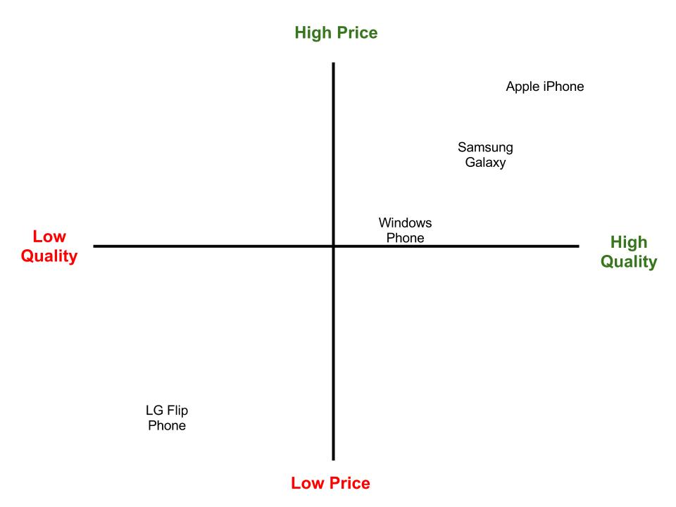
The perceptual map is a great way to visualize the competitive landscape of the industry in a short and succinct way. It’s also a great way to see how your product/brand stacks up in the mind of a consumer. Here’s an example I created for Apple.
Campaigns
The campaigns section is broke up into past campaigns and future initiatives.
Past campaigns create context for the on-boarding process. They also provide metrics on how the campaign performed. As a marketer, I like hearing stories of success and failure. For successful campaigns, I view this as an opportunity to focus and fine-tune, while failures show places to improve.
Future initiatives show where time is currently being spent, and show opportunities to get involved.
Message
I view this section as the keywords your company wants to win online. This is geared towards SEO efforts in particular, yet it should also encapsulate what you have learned during customer development. As you have conversations with customers, you will find common phrases/keywords that customers will use. Put these keywords in this section, it will be a good reference point.
Collateral
Oftentimes larger companies contract this work out, but this collateral should include web, print, and other forms of media that support marketing efforts. The purpose of this section is to give insight on how the marketing message is tailored to each channel. Feel free to put Facebook Ads/Google Adwords copy in this section.
Key Performance Indicators (KPIs)
What metrics should you be be paying extra special attention to? KPIs are simply the metrics that matter most to your company. Including these metrics in the style guide is important – it shows the marketing team what to focus on (instead of pageviews and other pointless stats.)
Acquisition Cost/Channel
What channels are profitable? How much does it cost to acquire new customers? This information allows new hires/consultants to quickly determine which channels are the most effective. Once again, the purpose is to provide areas to focus efforts.
Budget
The budget can seem tricky, but I would use this section to set benchmarks for how much to spend on each channel per month or quarter. How much should we spend on PPC? Print? Trade Shows? You get the point.
Once again, I’ve created a sample guide on Github, check it out, and let me know what you think on Twitter.
